
Data Visualization using Python
Data Visualization
Data visualization is the graphical representation of information and data. By using visual elements like graphs, charts and maps. Data visualization tools provide an accessible way to see and understand trends, outliers and pattern in data. Data visualization draws on the theory of visual perception and cognition to present data in graphical forms that humans can quickly and effectively interpret. It leverages concepts such as pre-attentive processing, where visual properties like color and size are rapidly perceived without focused attention. Lastly, choosing the right type of chart aligns with the nature of the data and the intended message, enhancing the overall effectiveness of visualizations.
Dataset
A dataset is a structured collection of data that is organized and stored for easy access, management, and analysis. It serves as a foundational component in various fields, including statistics, machine learning, and data science. A dataset typically consists of individual data points or observations, each representing a specific unit of information.
Netflix Dataset:
In the context of our conversation, the term “given dataset” refers to the dataset that mentioned or provided for analysis and visualization. Specifically, shared a dataset related to Netflix, including information such as show or movie titles, directors, release years, ratings, durations, genres, and descriptions.

Import the pandas library and aliases it as pd. This is a common convention in the Python data science community.
the pd.read_csv() function is used to read the contents of the CSV file ‘data_netflix.csv’ and create a DataFrame named df. The DataFrame is a two-dimensional, tabular data structure with rows and columns.
The print(df) statement is used to display the entire DataFrame. This will output the contents of the DataFrame to the console, showing all rows and columns.
Consider the given above dataset for which we will be plotting different charts.
Here, we using shape of method in Pandas to define rows and columns in Netflix Dataset.

As we all knew that we have to import the modules based on the visualization. Below there are few charts that we are going to learn using Data visualization.
1.Bar Chart
What is Bar Chart?
- A bar chart is a graphical representation of data that uses rectangular bars or columns to display the values of different categories or groups.
- Each bar’s length or height corresponds to the quantity or magnitude of the data it represents. Bar charts are commonly used for visualizing categorical data, making comparisons between different groups, and showing the distribution of a single categorical variable.
- The bars are typically arranged along one axis (commonly the x-axis), with each bar corresponding to a specific category or group.
- Bar charts are effective in conveying information in a clear and easy-to-understand manner, making them a popular choice for data visualization in various fields such as statistics, business, and scientific research.
When we should use a Bar Chart?
- Bar charts are best used for comparing the magnitudes of different categories or groups, making them suitable for displaying categorical data and illustrating frequency distributions.
- They effectively convey part-to-whole relationships and are adept at highlighting extremes or outliers. Bar charts are particularly useful for showcasing trends over discrete time periods, and their simplicity and ease of interpretation make them suitable for a broad audience.
- Well-suited for nominal and ordinal data, bar charts are an excellent choice when dealing with a limited number of data points and when the emphasis is on a straightforward visual comparison of values across categories.
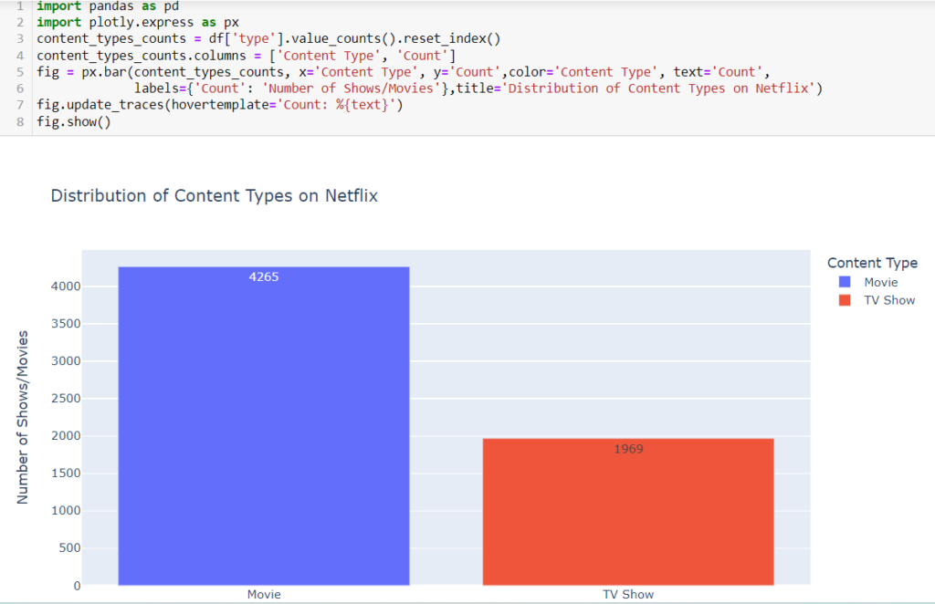
What does the bar chart illustrating the distribution of content types (Movies vs. TV Shows) in the given Netflix dataset reveal about the platform’s content diversity?
Code Explanation:
- pandas is a library for data manipulation and analysis.
- Plotly Express to create an interactive bar chart from a DataFrame with ‘categories’ and ‘counts’ columns, offering an intuitive and visually appealing representation of categorical data distributions.
- content_types_counts = df[‘type’].value_counts().reset_index() counts the number of occurrences of each unique value in the ‘type’ column (which represents content types – Movies or TV Shows). The result is a Pandas Series with counts, and reset_index() is used to reset index of the DataFrame.
- content_types_counts.columns = [‘Content Type’, ‘Count’] renames the columns of the DataFrame to make them more descriptive. The ‘index’ column is renamed to ‘Content Type’, and the count column retains the name ‘Count’.
- fig = px.bar(content_types_counts, x=’Content Type’, y=’Count’,color=’Content Type’, text=’Count’,
labels={‘Count’: ‘Number of Shows/Movies’},title=’Distribution of Content Types on Netflix’):
plotly.express library to create an interactive bar chart. Here’s a breakdown of the parameters.
content_types_counts: The DataFrame used for plotting.
x=’Content Type’: The ‘Content Type’ column is used as the x-axis.
y=’Count’: The ‘Count’ column is used as the y-axis.
color=’Content Type’: Different colors are used for each content type (Movies or TV Shows).
text=’Count’: The count values are displayed as text on the bars.
- labels={‘Count’: ‘Number of Shows/Movies’}: Customizes the y-axis label for better readability.
title=’Distribution of Content Types on Netflix’: Adds a title to the chart.
- fig.update_traces(hovertemplate=’Count: %{text}’) traces of the chart, specifically the hover template. It configures the hover template to display the count (%{text}) when hovering over the bars.
- fig.show() displays the bar chart.
Graph Insights:
- The chart provides a quick overview of the overall distribution of content types on Netflix. It shows the relative proportions of Movies and TV Shows in the dataset.
- The lengths of the bars directly represent the counts of Movies and TV Shows. Users can visually compare the counts of each content type.
- The count values are displayed on top of each bar, providing precise numerical information. This feature helps users understand the specific count for each category.
- The chart is interactive, allowing users to hover over each bar and see the exact count. This feature enhances the user experience and provides detailed information on demand.
- Colors are used to differentiate between Movies and TV Shows. Movies may be represented by one color (e.g., skyblue), and TV Shows by another (e.g., lightcoral). This color scheme aids in quickly identifying each content type.
- The title “Distribution of Content Types on Netflix” provides context for what the chart is illustrating, ensuring clarity for anyone viewing the visualization.
- Viewers can understand the composition of Netflix’s content library in terms of the proportion of Movies and TV Shows. This information is valuable for content creators, analysts, and decision-makers.
- The chart serves as a visual check on the data, allowing users to quickly verify if the distribution aligns with expectations or if there are any unexpected patterns.
- The visualization is an effective communication tool, enabling stakeholders to grasp key information about content types without delving into raw data.
- Depending on user interests or business goals, the distribution of content types may be a critical factor. For example, a streaming platform might want to balance the library’s diversity by maintaining a mix of both Movies and TV Shows.
- Users can explore the chart to gain insights into how the distribution has changed over time or in response to specific events, content strategies, or user preferences.
2.Pie Chart
What is Pie Chart?
- A pie chart is a circular statistical graphic that is divided into slices to illustrate numerical proportions. Each slice represents a proportionate part of the whole, and the total of all slices equals 100%.
- Pie charts are commonly used to show the distribution of a categorical variable or the proportional contribution of different categories to a whole.
- Pie charts are effective for conveying the relative distribution of data categories when the number of categories is small and the differences between categories are significant.
- However, they can become less effective when there are too many categories or when the differences between categories are subtle.It’s important to note that pie charts are best suited for displaying data with clear proportions, and other chart types, such as bar charts or stacked bar charts, may be more appropriate for certain types of data or comparisons.
When we should use a Pie Chart?
- Pie charts are best suited for illustrating the proportional contribution of a few categories to a whole, making them effective for displaying simple data distributions.
- They excel in scenarios with a limited number of categories (typically fewer than seven) and where the emphasis is on highlighting percentages. Pie charts visually convey part-to-whole relationships, making them suitable for presentations and emphasizing the relative magnitudes of components.
- However, they should be used judiciously, especially for complex datasets, as they can be less precise in representing differences between categories compared to other chart types like bar charts.
How does the pie chart depicting the percentage distribution of content ratings in the provided Netflix dataset offer insights into the diversity of available content?

Code Explanation:
- pandas is a library for data manipulation and analysis.
- Matplotlib, a comprehensive 2D plotting library in Python, facilitates the creation of pie charts through its plt.pie() function, offering a straightforward way to visually represent categorical data distributions with customizable features.
- ratings_counts = df[‘rating’].value_counts() calculates the frequency of each unique rating in the ‘rating’ column of the DataFrame.
- plt.figure(figsize=(7, 8)) sets the size of the pie chart to (7, 8) inches. plt.pie(ratings_counts, labels=ratings_counts.index, autopct=’%1.1f%%’, colors=[‘lightgreen’, ‘lightblue’, ‘lightcoral’, ‘gold’]) creates the pie chart.
- ratings_counts is the data to be plotted.
- labels=ratings_counts.index assigns labels to each portion of the pie chart based on the unique ratings.
- autopct=’%1.1f%%’ displays the percentage on each slice with one decimal place.
- colors=[‘lightgreen’, ‘lightblue’, ‘lightcoral’, ‘gold’] specifies the colors for each slice.
- plt.title(‘Distribution of Ratings on Netflix’) adds a title to the pie chart.
- plt.show() displays the pie chart.
Graph Insights:
- The size of each slice in the pie chart corresponds to the proportion of ratings it represents in the dataset. Larger slices indicate a higher frequency of that particular rating.
- Labels are attached to each slice, indicating the rating category it represents. These labels make it easy for viewers to identify the ratings associated with each portion of the pie chart.
- The autopct=’%1.1f%%’ parameter in the plt.pie() function displays the percentage of each slice on the chart. This information provides a quantitative understanding of the distribution.
- The title “Distribution of Ratings on Netflix” provides an overall context for the chart, summarizing the visualized data.
- The overall size of the chart is controlled by the figsize parameter, which can be adjusted to suit the desired dimensions. In this case, it is set to (7, 8) for a width of 7 inches and a height of 8 inches.
3. Scatter Plot
What is Scatter Plot?
- A scatterplot is a type of data visualization that displays individual data points on a two-dimensional graph. Each data point in the plot represents the values of two variables, typically one on the horizontal (x-axis) and the other on the vertical (y-axis).
- Scatterplots are valuable for visualizing the relationship or correlation between two continuous variables and identifying patterns, trends, or clusters within the data. Scatterplots are widely used in various fields, including statistics, data analysis, and scientific research, to explore and understand the relationships between two continuous variables.
- They are especially useful for identifying correlations, outliers, and patterns in the data, providing valuable insights for further analysis.
When we should use a Scatter Plot?
- Scatter plots are crucial for exploring relationships between two continuous variables, aiding in pattern identification, outlier detection, and correlation assessment.
- They excel in visually comparing values, making them essential for understanding the distribution and spread of data points. Scatter plots are particularly effective in regression analysis, highlighting how well a model fits the observed data.
- They help identify clusters and patterns, providing valuable insights into multivariate relationships. The visual simplicity of scatter plots makes them ideal for interactive data exploration and is especially useful when examining trends and correlations in a clear and concise manner.
How does the scatter plot, showcasing the relationship between release years and content durations in the provided Netflix dataset, reveal patterns or trends in the evolution of content over time?

Code Explanation:
- pandas is a library for data manipulation and analysis.
- Matplotlib, a versatile 2D plotting library in Python, employs the plt.scatter() function to easily create scatter plots, enabling the visualization of relationships between two numerical variables with customizable markers and styles.
- plt.figure(figsize=(8, 5)) sets the size of the scatter plot to (8, 5) inches. plt.scatter(df[‘release_year’], df[‘duration’].str.extract(‘(\d+)’).astype(float), alpha=0.7, color=’purple’) creates the scatter plot.
- df[‘release_year’] represents the x-axis variable (Release Year).
- df[‘duration’].str.extract(‘(\d+)’).astype(float) represents the y-axis variable (Duration), extracted as numerical values from the ‘duration’ column. The astype(float) is used to convert the extracted values to floating-point numbers.
- alpha=0.7 sets the transparency of the points to 0.7, making overlapping points more visible.
- color=’purple’ specifies the color of the points as purple.
- plt.title(‘Scatter Plot of Release Year vs. Duration’) adds a title to the scatter plot.
- plt.xlabel(‘Release Year’) and plt.ylabel(‘Duration (in minutes)’) label the x-axis and y-axis, respectively.
- plt.show() displays the scatter plot.
Graph Insights:
- Each point on the scatter plot represents an individual show or movie in the dataset. The x-coordinate corresponds to the release year, and the y-coordinate represents the duration.
- The overall pattern or distribution of points in the plot can provide insights into the relationship between release year and duration. Patterns such as clusters, trends, or outliers may be observed.
- The x-axis represents the release year, allowing viewers to observe trends or changes over time. The y-axis represents the duration in minutes, indicating the length of shows or movies.
- The title “Scatter Plot of Release Year vs. Duration” provides context for the chart, summarizing the visualized relationship. The x-axis label “Release Year” and y-axis label “Duration (in minutes)” offer clarity on the variables being represented.
- Examining the scatter plot may reveal trends or patterns, such as whether the duration of shows/movies has changed over the years. Clusters of points may suggest commonalities in release years and durations.
4. Line Chart
What is Line Chart?
- A line chart, also known as a line plot or line graph, is a type of chart that displays data points connected by straight line segments.
- This visualization method is particularly effective for showing trends and patterns over a continuous interval or time span.
- In a line chart, the x-axis typically represents the independent variable (e.g., time or a sequence of events), and the y-axis represents the dependent variable. Line charts are commonly used in various fields, including economics, finance, science, and data analysis, to visualize and communicate trends, fluctuations, and correlations in the data. They provide a clear and intuitive representation of how a variable changes over time or across different conditions.
When we should use a Line Chart?
- Line charts are best suited for visualizing trends over time or sequence, making them ideal for time-series analysis and emphasizing changes or patterns in data.
- They effectively connect individual data points, providing a clear representation of quantitative trends and facilitating comparisons across multiple categories. Line charts are valuable when showcasing the progression of events or geographical sequences.
- They are particularly useful in comparing trends between multiple data series on the same chart and providing insight into continuous data.
- When dealing with numerous data points, line charts offer a concise overview of the overall trend without overwhelming the viewer. The simplicity of line charts makes them effective for emphasizing changes and variations in a straightforward manner.
How does the line chart depicting the yearly trend in the addition of shows and movies to Netflix provide insights into the platform’s growth and content acquisition strategies?

Code Explanation:
- pandas is a library for data manipulation and analysis.
- Matplotlib employs the plt.plot() function to create line charts, allowing for the depiction of trends and patterns in numerical data over a continuous range, aiding in visualizing and analyzing time series or sequential data.
- df[‘date_added’] = pd.to_datetime(df[‘date_added’], errors=’coerce’): Converts the ‘date_added’ column to datetime format, allowing for easier manipulation of date-related information.
- df[‘year_added’] = df[‘date_added’].dt.year: Extracts the year from the ‘date_added’ column and creates a new column ‘year_added’.
- shows_added_per_year = df[‘year_added’].value_counts().sort_index(): Counts the number of shows/movies added each year and sorts the result by the year.
- plt.figure(figsize=(10, 4)): Sets the size of the figure.
- plt.plot(shows_added_per_year.index, shows_added_per_year.values, marker=’o’, linestyle=’-‘, color=’orange’): Creates the line chart.
- marker=’o’: Adds circular markers on data points for better visibility.
- linestyle=’-‘: Specifies a solid line.
- color=’orange’: Sets the line color.
- plt.title(‘Number of Shows/Movies Added to Netflix Over the Years’): Adds a title to the chart.
- plt.xlabel(‘Year’) and plt.ylabel(‘Number of Shows/Movies Added’): Labels the x-axis and y-axis.
- plt.grid(True): Adds grid lines to the plot for better readability.
- plt.show(): Displays the line chart.
Graph Insights:
- Each point on the orange line represents the number of shows/movies added to Netflix in a specific year. The line connects these data points, providing a visual representation of the trend.
- The x-axis represents the years (from the earliest to the most recent), while the y-axis represents the corresponding number of shows/movies added each year.
- The title “Number of Shows/Movies Added to Netflix Over the Years” provides an overall context for the chart, summarizing the visualized data.
- The x-axis label “Year” and the y-axis label “Number of Shows/Movies Added” provide clarity on the variables being represented, aiding interpretation.
- The grid lines assist in reading values from the chart. Each grid intersection corresponds to a specific year and the associated number of shows/movies added.
- By examining the slope and direction of the line, you can identify the overall trend in content additions. A rising trend indicates an increase in additions over the years, while a falling trend suggests a decrease.
- Look for fluctuations and patterns in the line. Spikes or drops may indicate specific events, seasons, or changes in Netflix’s content strategy.
- The chart provides a historical context, showing how the content library has evolved over time. It offers a snapshot of the growth or changes in content additions.
- The line between data points represents interpolated values, assuming a continuous relationship between observed years. This is especially important when data points are not available for every single year.
- The line chart serves as a tool for analysis, enabling viewers to derive insights into historical trends, make comparisons across years, and identify notable occurrences.
5. Box Plot
What is Box Plot?
- A boxplot, also known as a box-and-whisker plot, is a graphical representation that displays the distribution and key summary statistics of a continuous dataset.
- It provides a concise and informative summary of the central tendency, spread, and potential outliers within the data. Boxplots are especially useful for comparing the distributions of multiple datasets or variables and identifying any variations in their central tendencies and spreads.
- They are commonly used in statistical analysis and data exploration to gain insights into the characteristics of a dataset and to compare different groups or categories effectively.
When we should use a Box Plot?
- Box plots are ideal for comparing distributions and identifying outliers in datasets, providing a visual summary of central tendency and variability.
- They are effective in handling skewed data, revealing quartiles, and visualizing the spread of information. Box plots excel in comparing multiple groups simultaneously, making differences in medians and dispersion easily discernible.
- Particularly useful for large datasets, box plots condense information into a concise visual format, aiding in interpretation. They offer insights into the skewness and symmetry of distributions based on whisker position and length.
- When the goal is to compare the spread or variability across different categories, box plots provide a standardized representation. Additionally, box plots serve as a visual display of summary statistics, making them valuable in statistical analysis and communication of key dataset characteristics.
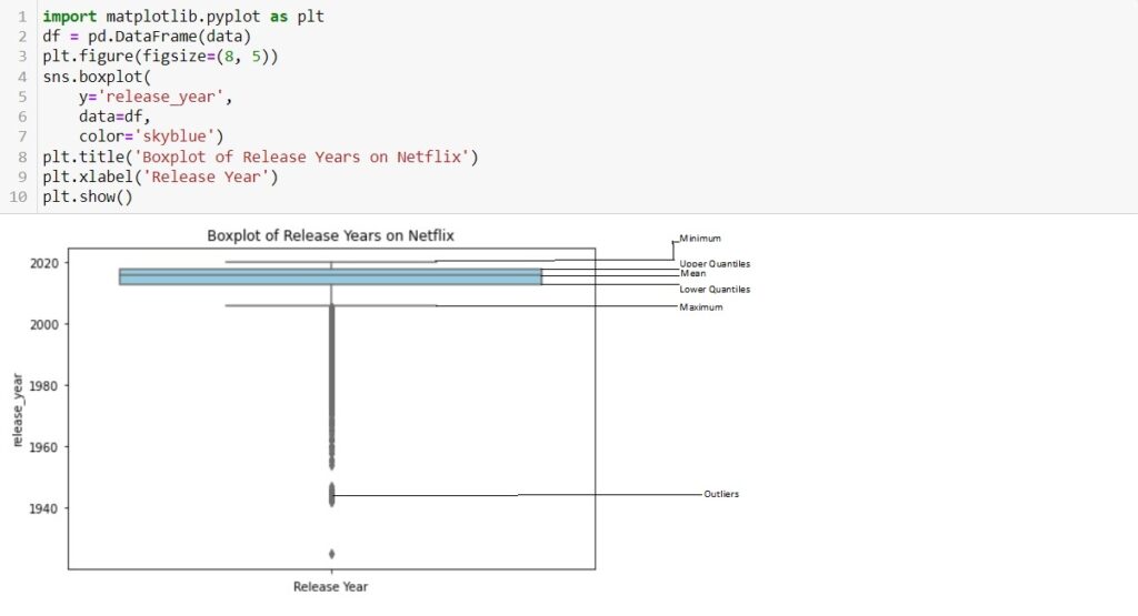
How does the box plot representing the distribution of release years in the provided Netflix dataset offer insights into the temporal spread of content?
Code Explanation:
- pandas is a library for data manipulation and analysis . Matplotlib utilizes the plt.boxplot() function to construct boxplots, providing a concise representation of the distribution, central tendency, and outliers within numerical datasets, aiding in statistical summary and comparison.
- df = pd.DataFrame(data): Assumes you have a DataFrame named df containing Netflix data. The specific structure of the DataFrame is not provided in the code snippet. plt.figure(figsize=(8, 5)): Specifies the size of the figure (8 inches wide and 5 inches tall) for the upcoming plot.
- sns.boxplot(y=’release_year’, data=df, color=’skyblue’): Creates a boxplot using Seaborn.
- y=’release_year’: Specifies that the ‘release_year’ column from the DataFrame df will be plotted on the y-axis.
- data=df: Specifies the DataFrame containing the data.
- color=’skyblue’: Sets the color of the box in the boxplot.
- plt.title(‘Boxplot of Release Years on Netflix’): Adds a title to the boxplot.
- plt.xlabel(‘Release Year’): Labels the y-axis as ‘Release Year’ to provide context for the variable being plotted.
- plt.show(): Displays the boxplot.
Graph Insights:
- The box represents the interquartile range (IQR) of the release years. The length of the box spans from the first quartile (Q1) to the third quartile (Q3). The central 50% of the release years falls within this range.
- The box in the boxplot represents the Interquartile Range (IQR), which is calculated as follows: IQR=Q3−Q1
- The line inside the box represents the median release year. It indicates the midpoint when the release years are sorted. In this context, it provides a measure of central tendency for the distribution.
- The whiskers extend from the box to the minimum and maximum values within a defined range. The length of the whiskers is typically determined using a rule, such as “1.5 times the IQR.” Values beyond the whiskers are considered potential outliers.
- Individual data points beyond the whiskers are plotted as points. These points represent potential outliers, i.e., release years that significantly differ from the majority of the data.
- The title “Boxplot of Release Years on Netflix” provides an overall context for the chart, summarizing the visualized distribution. The y-axis label “Release Year” indicates the variable represented on the y-axis.
- By interpreting these elements, viewers can gain a comprehensive understanding of the distribution of release years for shows/movies on Netflix, identify any anomalies, and assess the overall pattern of the data.
6. Stacked Bar Chart
What is Stacked Bar Chart?
- A stacked bar chart is a type of bar chart where multiple bars are stacked on top of each other, and the total height of the stacked bars represents the combined value of the individual components.
- Each segment of the stacked bar corresponds to a different category or subgroup, and the overall height of the bar illustrates the total sum across these categories.
- This type of chart is useful for visualizing the composition and relative contributions of different subgroups within a whole.
When we should use a Stacked Bar Chart?
- Stacked bar charts are effective for part-to-whole comparisons, illustrating the contribution of multiple categories to a total. They excel in visualizing cumulative data, allowing for a clear representation of each category’s share within a bar.
- Stacked bar charts are particularly useful for tracking changes over time, showcasing variations in category composition. Ideal for percentage composition comparisons, they offer insights into the distribution of values within each bar.
- Suited for hierarchical data and comparisons across subcategories, stacked bar charts provide a concise representation of complex data structures. They emphasize both total values and relationships between subcategories, making them versatile for comprehensive visual analysis.
- In scenarios where the focus is on showcasing cumulative impact or magnitude, stacked bar charts serve as a powerful visual tool.
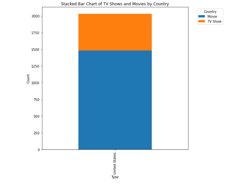
How does the distribution of TV shows and movies vary across categories in the stacked bar chart?

Code Explanation:
- df[‘country’] == ‘United States’: This part creates a boolean mask, where each element in the ‘country’ column is checked to see if it is equal to ‘United States’. This results in a Series of True and False
- df[df[‘country’] == ‘United States’]: This part uses the boolean mask to filter the rows of the original DataFrame df. Only the rows where the condition is True (i.e., where the country is the United States) will be included in the new DataFrame us_movies.

Code Explanation:
- Imports the necessary libraries: pandas for data manipulation and matplotlib for data visualization.
- Reads a CSV file named ‘data_netflix.csv’ into a pandas DataFrame named df. The head(10) method is then used to display the first 10 rows of the DataFrame.
- Prints the first 10 rows of the DataFrame df to the console.
- Creates a new DataFrame named us_movies by filtering the original DataFrame (df) to include only rows where the ‘country’ is ‘United States’. This DataFrame now contains information about movies released in the United States.
- Creates a two-way contingency table using the pd.crosstab function. It counts the occurrences of each combination of ‘country’ and ‘type’ in the us_movies DataFrame.
- Creates a stacked bar chart using the plot The ‘kind’ parameter is set to ‘bar’, and stacked=True is used to create a stacked bar chart. The ‘figsize’ parameter adjusts the size of the figure.
- plt.xlabel(‘Type’): Set the label for the x-axis.
- plt.ylabel(‘Count’): Set the label for the y-axis.
- plt.title(‘Stacked Bar Chart of TV Shows and Movies by Country’): provide a title for the chart.
- Add a legend to the chart, specifying the title and the location of the legend
- plt.show(): display the chart.
Graph Insights:
- The x-axis represents the different categories of the ‘type’ variable, which indicates whether a given entry is a ‘TV Show’ or a ‘Movie’.
- The y-axis represents the count of entries in the DataFrame corresponding to each category on the x-axis.
- Each bar on the chart represents the total count of ‘TV Show’ and ‘Movie’ entries for the ‘United States’.
- Each bar is divided into two segments, one for ‘TV Show’ and one for ‘Movie’. The height of each segment represents the count of entries of that type.
- The stacked=True parameter in the plot function creates a stacked bar chart. This means that the ‘TV Show’ and ‘Movie’ segments are stacked on top of each other for each category on the x-axis.
- The legend on the upper left corner indicates the color coding for each segment. In this case, it shows that ‘TV Show’ is represented by one color, and ‘Movie’ is represented by another.
- The title of the chart is set to ‘Stacked Bar Chart of TV Shows and Movies in the United States’. The x-axis label is ‘Type’, and the y-axis label is ‘Count’.
- The figsize parameter sets the dimensions of the figure, making it 8 inches by 8 inches.
- The bbox_to_anchor and loc parameters in plt.legend are used to position the legend outside the plot for better visibility. The legend title is set to ‘Type’.
7. HeatMap
What is HeatMap?
- A heatmap is a graphical representation of data where values in a matrix are depicted using a color gradient.
- It is a visual way to represent the magnitude of a phenomenon in a two-dimensional space, with colors indicating the intensity of values.
- Heatmaps are commonly used to analyze and display relationships within a dataset. heatmaps are effective tools for conveying complex information in a visually appealing and easy-to-understand format.
- They enable analysts, researchers, and decision-makers to quickly identify patterns and trends within the data.
When we should use a Heatmap?
- Heatmaps are ideal for visualizing relationships between two variables, such as correlation matrices or spatial data.
- They efficiently represent patterns and variations in data intensity, aiding in the identification of trends or anomalies. In applications like genomics, user behavior analysis, and machine learning, heatmaps offer quick insights into complex data.
- They are valuable for exploring multivariate datasets, providing an accessible means to convey intricate relationships. Overall, heatmaps are versatile tools that excel in conveying patterns and relationships in a concise visual format.
How would you succinctly alter the provided heatmap code to display the data with vertical color gradients instead of the default horizontal gradients?

Code Explanation:
- pandas is a library for data manipulation and analysis.
- The code starts by importing the seaborn library, often used for statistical data visualization.
- matplotlib.pyplot module for creating plots.
- The pivot_table function is used to create a table that summarizes the count of occurrences for each combination of ‘type’ (TV Show or Movie) and ‘rating’ in the Netflix dataset (netflix_df). The fill_value=0 parameter fills any missing values with zeros.
- This line sets the size of the plot figure to 10 units in width and 6 units in height using plt.figure(figsize=(width, height)).
- sns.heatmap is used to create the actual heatmap. heatmap_data: The data to be visualized. annot=True: Displays the actual values in each cell. fmt=’d’: Formats the annotations as integers. cmap=’YlGnBu’: Sets the color map to Yellow-Green-Blue. cbar_kws={‘label’: ‘Count’}: Adds a color bar with the label ‘Count’.
- plt.title(‘Netflix Ratings Distribution by Type’) sets the title of the plot to ‘Netflix Ratings Distribution by Type’.
- plt.xlabel(‘Rating’) sets the x-axis label to ‘Rating’.
- plt.ylabel(‘Type’) sets the y-axis label to ‘Type’.
- plt.show(): displays the heatmap plot.
Graph Insights:
- Darker colors represent higher counts, indicating more occurrences of a specific combination of content type (TV Show or Movie) and rating.
- Comparing the rows (TV Shows) and columns (Movies) allows you to identify which content type tends to have higher counts for specific ratings.
- Darker cells suggest common rating-content type combinations, indicating popular or prevalent ratings within each category.
- Annotated numbers in each cell provide the exact count of occurrences for the corresponding rating-category combination, offering quantitative insights.
- The ‘YlGnBu’ color palette signifies a sequential color scheme where lighter shades represent lower counts, and darker shades represent higher counts.
- The overall pattern of the heatmap reveals the distribution of ratings within TV Shows and Movies. Observe if there are concentrations of specific ratings in certain content types.
- The x-axis (Rating) and y-axis (Type) provide categorical information, allowing you to analyze how ratings are distributed across different types of content.
- The color bar on the side of the heatmap provides a reference for the color scale, helping interpret the relative frequency of each rating-content type combination.
8. Histogram
What is Histogram?
- A histogram is a graphical representation of the distribution of a dataset. It is a way to visualize the underlying frequency or probability distribution of a set of continuous or discrete data.
- Histograms are useful for understanding the shape of the distribution, identifying patterns, detecting outliers, and gaining insights into the central tendency and variability of the data.
- They are commonly used in statistics, data analysis, and data visualization.
When we should use a Histogram?
- Histograms are indispensable for revealing data distributions, spotting outliers, and assessing central tendencies. They provide a visual tool for comparing distributions, detecting skewness, and making informed decisions about preprocessing steps.
- Histograms offer insights into data spread and variability, aiding in the selection of appropriate analysis methods. Additionally, they serve as a quality assessment tool, revealing irregularities and gaps in the data.
- Histograms are versatile, providing accessible visualizations that effectively communicate data characteristics to both technical and non-technical audiences.
What does the histogram code for the Netflix dataset aim to visualize, and which specific column’s distribution is being represented?

Code Explanation:
- pandas is a library for data manipulation and analysis.
- import matplotlib.pyplot as plt: Imports the Matplotlib library, specifically the pyplot module, and aliases it as plt for plotting.
- release_years = netflix_df[‘release_year’]: Extracts the ‘release_year’ column from the DataFrame and assigns it to the variable release_years.
- plt.hist(release_years, bins=20, color=’skyblue’, edgecolor=’black’): Generates a histogram for the ‘release_year’ data. release_years: The data to be plotted. bins=20: Specifies the number of bins or intervals in the histogram. color=’skyblue’: Sets the color of the bars to sky blue. edgecolor=’black’: Sets the border color of the bars to black.
- plt.title(‘Distribution of Release Years in Netflix Dataset’): Sets the title of the histogram.
- plt.xlabel(‘Release Year’): Sets the label for the x-axis.
- plt.ylabel(‘Frequency’): Sets the label for the y-axis.
- plt.show(): Displays the generated histogram.
Graph Insights:
- The x-axis represents the range of release years in the Netflix dataset.
- Each bar on the x-axis corresponds to a specific range of release years, and the axis spans from the earliest to the latest release year in the dataset.
- The y-axis represents the frequency or count of occurrences for each range of release years.
- The height of each bar on the y-axis indicates how many shows or movies were released within a particular range of years.
- Each bar in the histogram corresponds to a bin or interval on the x-axis, representing a range of release years.
- The length or height of each bar corresponds to the number of shows or movies released within that particular range.
- Bins are the intervals into which the x-axis (release years) is divided. In this case, there are 20 bins, as specified by the bins=20 parameter in the hist function.
- Each bin covers a specific range of release years, and the histogram displays how many shows or movies fall into each bin.
- The color of the bars is set to ‘skyblue,’ providing a visual distinction for the histogram.
- The edgecolor (border color) is set to ‘black,’ making it easier to distinguish between individual bars.
- The title of the histogram is set to ‘Distribution of Release Years in Netflix Dataset.’
The x-axis label is ‘Release Year,’ and the y-axis label is ‘Frequency.’ These labels provide context for interpreting the information presented in the graph.
9. Area Chart
What is Area Chart?
- An area chart is a type of data visualization that displays the quantitative values of different groups over a continuous range.
- It is particularly useful for showing the cumulative magnitude of a quantity and highlighting the overall trend or distribution of data over time or another continuous variable.
- Area charts are effective visual tools for conveying cumulative trends and variations in data, especially when dealing with time-dependent or continuous variables.
- They provide a clear representation of the overall magnitude and distribution of a quantity over a specified range.
When we should use a Area Chart?
- Area charts are effective for visualizing cumulative data trends, especially over time. They highlight patterns and variations, making it easy to identify periods of growth or decline.
- Suitable for comparing multiple categories, the filled areas emphasize proportional contributions. This visualization method is valuable for understanding cumulative changes and the overall magnitude of quantities.
- Its utility extends to emphasizing sequential data and showcasing accumulated totals. Area charts provide a quick, intuitive insight into trends and proportions, making them ideal for conveying complex information in a concise and visually appealing manner.
What does the ‘Cumulative Number of Netflix Shows/Movies Over the Years’ area chart visually convey about the distribution and growth of content on Netflix?

Code Explanation:
- pandas is a library for data manipulation and analysis.
- import matplotlib.pyplot as plt: Imports the Matplotlib library for plotting.
- release_years = netflix_df[‘release_year’]: Extracts the ‘release_year’ column from the DataFrame.
- cumulative_counts = pd.DataFrame({‘Release Year’: release_years.unique()}): Creates a DataFrame with unique release years.
- cumulative_counts[‘Cumulative Count’]: Calculates the cumulative count for each release year using a lambda function.
- plt.fill_between(…): Uses the fill_between function to create an area chart. cumulative_counts[‘Release Year’], cumulative_counts[‘Cumulative Count’]: Specifies the x and y-axis values for the area chart.
- color=’skyblue’, alpha=0.4: Sets the color of the filled area to sky blue with a transparency of 0.4.
- plt.title(‘Cumulative Number of Netflix Shows/Movies Over the Years’): Sets the title of the area chart.
- plt.xlabel(‘Release Year’) Set label for the x axis
- plt.ylabel(‘Cumulative Count’): Set label for the y axis.
- plt.show(): Displays the generated area chart.
Graph Insights:
- The x-axis represents the release years of Netflix shows/movies.
- Each point on the x-axis corresponds to a unique release year.
- The y-axis represents the cumulative count of Netflix shows/movies released up to a given release year.
- The y-value at any point indicates the total number of shows/movies released by that year.
- The area beneath the line graph is filled, creating a shaded region.
- This filled area represents the cumulative count of shows/movies over time.
- The line graph is created by connecting the data points representing the cumulative count for each release year.
- It visually traces the overall trend of increasing cumulative counts over the years.
- The filled area is colored ‘skyblue’ to enhance visibility.
- The ‘alpha=0.4’ parameter sets transparency, allowing a clear view of overlapping areas.
- The title, ‘Cumulative Number of Netflix Shows/Movies Over the Years,’ provides context for the chart.
- The x-axis label is ‘Release Year,’ and the y-axis label is ‘Cumulative Count.’
- Each point on the line represents the cumulative count at a specific release year.
- By examining the line’s slope and shape, one can infer trends in the cumulative release of shows/movies.
- While not included in the code, a legend could be added if there were multiple series or categories represented in different colors.
Conclusion:
In conclusion, the Bar chart and Pie chart shed light on the distribution and popularity of genres in the Netflix dataset, unveiling both the mainstream and niche preferences. The Scatter Plot and Line Chart provide insights into correlations and trends over time, such as the relationship between viewer ratings and show duration. The Box Plot offers a glimpse into the distribution and potential outliers within numerical variables. Stacked Bar Chart illustrates the composition of the whole dataset, revealing the relative contributions of different elements. Heatmap highlights correlations between variables, aiding in understanding complex relationships. Histogram delves into the distribution of specific variables, like the duration of shows. The Area Chart summarizes cumulative contributions over time, offering a holistic view of content evolution. Together, these visualizations provide a comprehensive understanding of the Netflix dataset, guiding informed decisions for content creators and analysts in the streaming industry.