Exploratory Data Analysis-Sweetviz
Introduction:
Exploratory Data Analysis is a basic data analysis technique that is acronymic as EDA in the analytics industry. EDA is associated with several concepts and best practices that are applied at the initial phase of the analytics project. EDA is associated with graphical visualization techniques to identify data patterns and comparative data analysis. EDA is a preferred technique for feature engineering and feature selection processes for data science projects.

Some of the widely used EDA techniques are univariate analysis, bivariate analysis, multivariate analysis, bar chart, box plot, pie chart, line graph, frequency table, histogram, and scatter plots. EDA is very useful for the data preparation phase for which will complement the machine learning models.
One of the open-source Python library called Sweetviz (GitHub) that had built for this purpose. It Create a standalone HTML report using a Pandas data frame. One of few more libraries is Pandas Profiling.
Steps of exploratory data analysis:
The four steps of exploratory data analysis (EDA) typically involve:
- Data Cleaning: Handling missing values, removing outliers, and ensuring data quality.
- Data Exploration: Examining summary statistics, visualizing data distributions, and identifying patterns or relationships.
- Feature Engineering: Transforming variables, creating new features, or selecting relevant variables for analysis.
- Data Visualization: Presenting insights through plots, charts, and graphs to communicate findings effectively.
Objectives of EDA:
- Maximize insight into the database/understand the database structure;
- Visualize potential relationships (direction and magnitude) between exposure and outcome variables
- Detect outliers and anomalies (values that are significantly different from the other observations)
- Develop parsimonious models (a predictive or explanatory model that performs with as few
exposure variables as possible) or preliminary selection of appropriate models
- Extract and create clinically relevant variables. EDA methods can be cross classified as:
- Graphical or non-graphical methods
Type of data | Suggested EDA techniques |
Categorical | Descriptive statistics |
Univariate continuous | Line plot, Histograms |
Bivariate continuous | 2D scatter plots |
2D arrays | Heat map |
Multivariate: trivariate | 3D scatter plot or 2D scatter plot with a 3rd variable represented in different colour, shape or size |
Multiple groups | Side-by-side boxplot |
- Univariate (only 1 variable, exposure or outcome) or multivariate (several exposure variables alone or with an outcome variable) methods.
Native and automated libraries of EDA:
You can perform Exploratory Data Analysis (EDA) using native Python libraries at various stages of your data analysis process. Native libraries such as Pandas, Matplotlib, Seaborn, and NumPy provide a robust set of tools for data manipulation, visualization, and analysis. Here are some scenarios where you might choose to use native Python libraries for EDA
Customization:
If you have specific requirements for the appearance, layout, or interactivity of your visualizations, using native libraries allows you to have more control and customization over each aspect of the plots.
Specific Analysis Needs:
If you have specialized analysis needs that are not covered by automated tools like Sweetviz, you may prefer to use native libraries to tailor your analysis to those specific requirements.
Integration with Codebase:
If your data analysis is part of a larger Python codebase or workflow, using native libraries ensures seamless integration. You can easily incorporate your EDA code into your broader analysis pipeline.
Advanced Statistical Analysis:
For more advanced statistical analysis or hypothesis testing, native libraries provide the flexibility to implement specific statistical tests and calculations tailored to your research questions.
Educational Purposes:
If you are teaching or learning data analysis in Python, using native libraries allows for a more in-depth understanding of the underlying code and functions. It can be beneficial for educational purposes to write code manually and understand the steps involved
While native Python libraries offer great flexibility and control, it is important to note that they also require more manual coding compared to automated tools like Sweetviz. The choice between using automated tools and native libraries often depends on the specific requirements of your analysis, your familiarity with the tools, and the desired level of customization. Many data scientists use a combination of both approaches depending on the context and goals of their analysis
Sweetviz:
The decision to use Sweetviz or any other tool for Exploratory Data Analysis (EDA) depends on your specific needs, preferences, and the context of your data analysis project. Here are some reasons why you might consider using Sweetviz:
Quick Overview:
Sweetviz provides a quick and automated way to generate a comprehensive overview of your dataset. This can be especially useful when dealing with large datasets or when you want a quick understanding of the data before diving into more detailed analysis.
Automation:
Sweetviz automates the process of generating various visualizations and summary statistics, reducing the amount of manual coding required for EDA. This can save time and make the analysis process more efficient.
Comparative Analysis:
Sweetviz makes it easy to compare different datasets, such as training and testing sets, or datasets before and after pre-processing. The side-by-side comparison feature helps identify discrepancies or changes between datasets.
User-Friendly Reports:
Sweetviz generates user-friendly HTML reports that include visualizations and insights about the dataset. These reports are easy to share with team members, stakeholders, or collaborators who may not have programming skills.
Ease of Use:
Sweetviz requires minimal coding, making it accessible to individuals who may not be proficient in programming. Its simplicity makes it a good choice for those who want a quick and straightforward way to perform EDA.
That said, while Sweetviz offers advantages in terms of automation and ease of use, the choice of tools ultimately depends on your specific requirements and preferences. If you have specific visualization or analysis needs that are not met by Sweetviz, or if you prefer more control to the customization of visualizations, you may choose to use a combination of native Python libraries for EDA. It is essential to evaluate the strengths and limitations of different tools based on the goals of your analysis.
Features of Sweetviz Library
- Target analysis:This shows how a target value relates to other features.
- Mixed-type associations:Sweetviz integrates associations for categorical (uncertainty coefficient), numerical (Pearson’s correlation) & categorical-numerical (correlation ratio) datatypes smoothly, to deliver maximum information for all the data types.
- Visualize and compare -distinct datasets (e.g. training vs test data).
- Type inference: It automatically detects numerical, categorical & text features, with optional manual overrides.
- Summary information:
- Type, missing values, unique values, duplicate rows, & most frequent values.
- Numerical analysis like sum, min/max/range, quartiles, mean, mode, standard deviation, median absolute deviation, coefficient of variation, kurtosis, and skewness.
For creating the report, we have functions:
- analyze() for a single dataset
- compare() for compare 2 datasets
- compare_intra() for comparing 2 sub-populations within the same dataset
Getting Started:
To integrate sweetviz into your Python environment, start by installing it via pip
- Install Sweetviz: You can install it using pip

- Import library: Import libraries in your python or jupyter Notebook
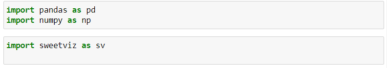
Import pandas as Pd
Import numpy as np
Import sweetviz as sv
- Load your dataset: Load your dataset using pandas or any other library you prefer

Analyze:
Use this version when there is only a single dataset to analyze, and you do not wish to compare sub populations together
Analyze (source: Union [pd.DataFrame, Tuple [pd.DataFrame, str]],
target_feat: str = None,
feat_cfg: FeatureConfig = None,
pairwise_analysis: str = ‘auto’):
Analyze () function can take multiple other arguments:
- Source: either the data frame (as in the example) or a tuple containing the data frame and a name to show in the report. e.g. my_df or [my_df, “Automobile”]
- Target_feat: a string representing the name of the feature to be marked as “target”. Only BOOLEAN and NUMERICAL features can be targets for now.
- pairwise_analysis: Correlations and other associations can take quadratic time (n^2) to complete. The default setting (“auto”) will run without warning until a data set contains “association_auto_threshold” features. Past that threshold, you need to explicitly pass the parameter pairwise_analysis=”on”(or =”off”) since processing that many features would take a long time. This parameter also covers the generation of the association graphs (based on Drazen Zaric’s concept) that will be covered below.
- feat_cfg: a FeatureConfigobject representing features to be skipped, or to be forced a certain type in the analysis. The arguments can be either a single string or list of strings.
Using feat_cfg to force data types or skip columns
Possible parameters for the Feature Config parameters are:
- skip
- force_cat
- force_num
- force_text
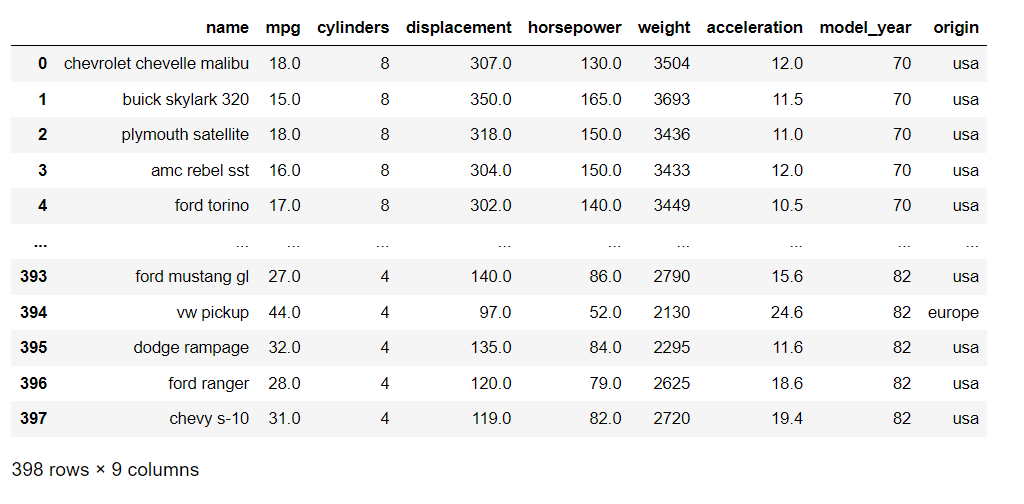
Loading automobile dataset:

- Generate the report: Use sweetviz to create a report

- Show the report: To view the report, you can use the following command

Output:

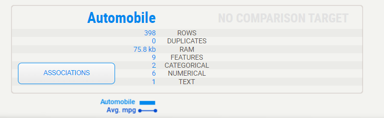
Summary display:
The summary shows us the characteristics of Automobile data. That legend at the bottom shows us that the Automobile set does contain the “Avg.mpg”
Target variable:

When a target variable is specified, it will show up first, in a special black box. We can note from the above summary that “Avg.mpg” has no missing data in the Automobile data
Detail area:
When you move the mouse to hover over any of the variables, an area to the right will display the details. The content of the details depends on the type of variable being analysed. In the case of a categorical (or Boolean) variable, as is the case with the target, the analysis is as follows:

Lorem ipsum dolor sit amet, consectetur adipiscing elit. Ut elit tellus, luctus nec ullamcorper mattis, pulvin
Association:
The Associations graph shows the pairwise relationships between all pairs of features in the dataset, with each dot representing a unique combination of two features. The size and colour of the dot indicate the strength and direction of the association between the two features, with larger and darker dots indicating stronger positive associations and smaller and lighter dots Indicating weaker or negative associations.
ar dapibus leo.

Numerical data:

Numerical data shows more information on its summary. Here, we can see that in this case, about 2% of data is missing
Note that the target values (MPG) plotted as a line right over the distribution graph. This enables instant analysis of the target distribution with regard to other variables.
Interestingly, we can see from the graph on the right that the survival rate is consistent across all ages, except for the youngest, which have a higher survival rate. It would look like “women and children first” was not just talk.
Detail area (numerical):
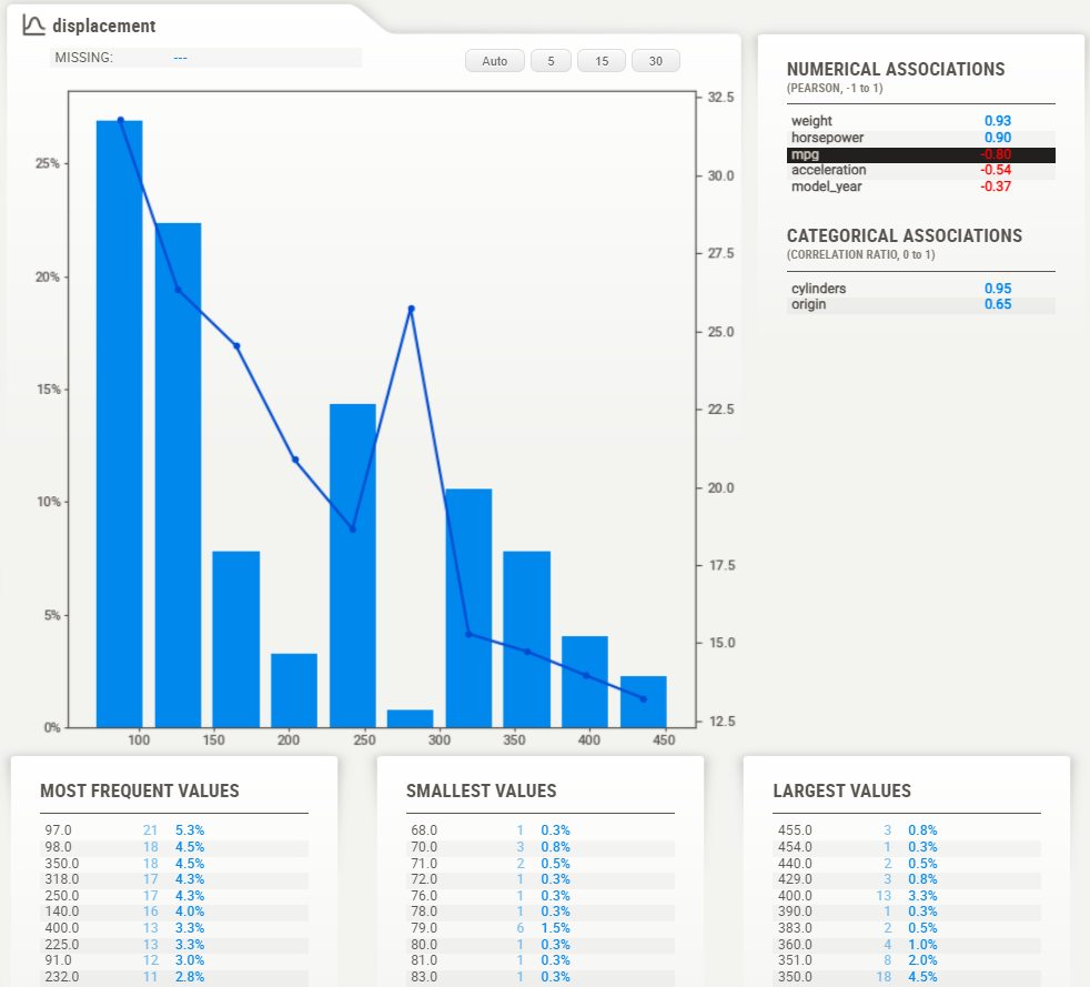
As with the categorical data type, the numerical data type shows some extra information in its detail area. Noteworthy here are the buttons on top of the graph. These buttons change how many “bins” are shown in the graph. You can select the following:Auto: 5, 15, 30
Text data:

For now, anything that the system does not consider numerical or categorical data will be deemed as a “text”. Text features currently only show count (percentage) as stats.
Compare:
Use this version when you have two data sets to compare together (e.g. Train versus Test).
Compare (source: Union [pd.DataFrame, Tuple [pd.DataFrame, STR]],
Compare: Union [pd.DataFrame, Tuple [pd.DataFrame, str]],
target_feat: str = None,
feat_cfg: FeatureConfig = None,
pairwise_analysis: STR = ‘auto’)
The parameters are the same as `analyze () `, with the addition of a `compare` parameter. Usage was demonstrated in the “Basic Usage” section at the beginning.
Loading dataset:

Test dataset:

Train dataset:

Comparing two data frame (Test vs Train):
Output:

Summary display:
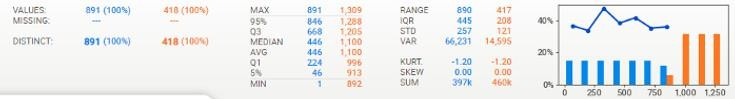
The summary shows us the characteristics of both data frames side-by-side. We can immediately identify that the testing set is roughly half the size of the training set, but that it contains the same features. That legend at the bottom shows us that the training set does contain the “Survived” target variable but that the testing set does not.

Target variable:

When a target variable is specified, it will show up first, in a special black box. We can note from this summary that “Survived” has no missing data in the training set (891, 100%), that there are 2 distinct possible values (accounting for less than 1% of all values), and from the graph, it can be estimated that roughly 60% did not survive.
Detail area:
When you move the mouse to hover over any of the variables, an area to the right will display the details. The content of the details depends on the type of variable being analyzed. In the case of a categorical (or Boolean) variable, as is the case with the target, the analysis is as follows:

Here, we can see the exact statistics for each class, where 62% did not survive, and 38% survived. You also get the detail of the associations for each of the other features.
Association:
The Associations graph shows the pairwise relationships between all pairs of features in the dataset, with each dot representing a unique combination of two features. The size and colour of the dot indicate the strength and direction of the association between the two features, with larger and darker dots indicating stronger positive associations and smaller and lighter dots indicating weaker or negative associations.

compare_intra:
Use this when you want to compare 2 some populations within the same dataset. This is also a very useful report, especially when coupled with target feature analysis!
In our Titanic example, we could use it to compare the male vs female populations, and see if survivability affected by different factors that are gender-specific.
compare_intra(source_df: pd.DataFrame,
condition_series: pd.Series,
names: Tuple[str, str],
target_feat: str = None,
feat_cfg: FeatureConfig = None,
pairwise_analysis: str = ‘auto’)
The parameters are once again similar, however this time you must also provide you provide a boolean test (‘condition_series’) that splits the population (here we use train[“Sex”] == ‘male’, to get a sense of the different gender populations), and give a name to each subpopulation.
Output:

The names Tuple is for the populations given by the conditional series in order: [TRUE, FALSE].
Individual fields:
Passenger ID
- His distribution of ID’s and survivability is even and ordered, as you would hope/expect, so no surprises here.
- No missing data
Sex:
- About twice as many males as females, but…
- Females were much more likely to survive than males
- Looking at the correlations, Sex is correlated with Fare, which is, and is not surprising…
- Similar distribution between Train and Test
- No missing data
Age:
- 20% missing data, consistent missing data and distribution between Train and Test
- Young-adult-centric population, but ages 0–70 well represented
- Surprisingly evenly distributed survivability, except for a spike at the youngest age\
- Using 30 bins in the histogram in the detail window, you can see that this survivability spike is really for the youngest (about <= 5 years old), as at about 10 years old survivability is low.
- Age seems related to Siblings, Pclass and Fare, and a bit more surprisingly to Embarked
General analysis:
- Overall, most data is present and seems consistent and make sense; no major outliers or huge surprises
Test versus Training data
- Test has about 50% fewer rows
- Train and Test data are matched in the distribution of missing data
- Train and Test data values are very consistent across the board
Association/correlation analysis
- Sex, Fare and Pclass give the most information on Survived
- As expected, Fare and Pclass are highly correlated
- Age seems to tell us a good amount regarding Pclass, siblings and to some degree Fare, which would be somewhat expected. It seems to tell us a lot about “Embarked” which is a bit more surprising.
Missing data
- There is no significant missing data except for Age (~20%) and Cabin (~77%) (and an odd one here and there on other features)
Conclusion:
Sweetiz emerges as a promising addition to the toolkit of data professionals, offering .Its unique features, ease of use, or other distinguishing factors set it apart in the crowded landscape of data analysis tools. As data scientists continue to seek innovative solutions to streamline workflows and derive meaningful insights from complex datasets, Sweetiz stands poised to play a pivotal role in shaping the future of [mention the relevant domain, e.g., data analysis, machine learning.
Reference:
ation/308007227_Exploratory_Data_Analysis
https://pypi.org/project/sweetviz/
https://www.geeksforgeeks.org/sweetviz-automated-exploratory-data-analysis-eda/
https://github.com/fbdesignpro/sweetviz
Krish naik YT https://youtu.be/D4fHn4lHCmI?si=jQ8QRVS28-ZJ13Vs
Html Report https://github.com/jeyaprathap2612/SWEETVIZ-EDA.git
https://www.datainsightonline.com/post/exploratory-data-analysis-with-sweetviz-library-in-python-part-1